

If you remember my Christmas Blog Swap Goodies post (you can read the full post here) with the beautiful and talented Ishah, then you'll remember she gifted me a few Wet n' Wild palettes! One of the Color Icon palettes she sent over to me was the very neutral Comfort Zone.
It has since become one of my favourite palettes, and one of my most used palettes! It's super easy to create a safe-for-work look, but just as easy to create the perfect smokey eye (with an olive twist, if you're using the second half!)
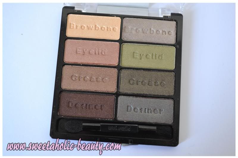
Comfort Zone has eight different colours, all of which are meant to create two different natural looks. On the left, we have the browns and on the right, we have the greens. Very comforting for those who like to keep their eyes simple, but versatile enough for those who want a little more bang for their buck.
The great thing about the Wet n' Wild palette is that they are practically dummy proof. You don't need to be a professional make-up artist to be able to create a professional look anymore, because Wet n' Wild tell you exactly where each colour is supposed to go. I think this is great for those just starting out, or those who are just beginning to experiment. For those of us who are a bit too comfortable around the old blending brush, it's a basic guideline - but a line we can still cross!
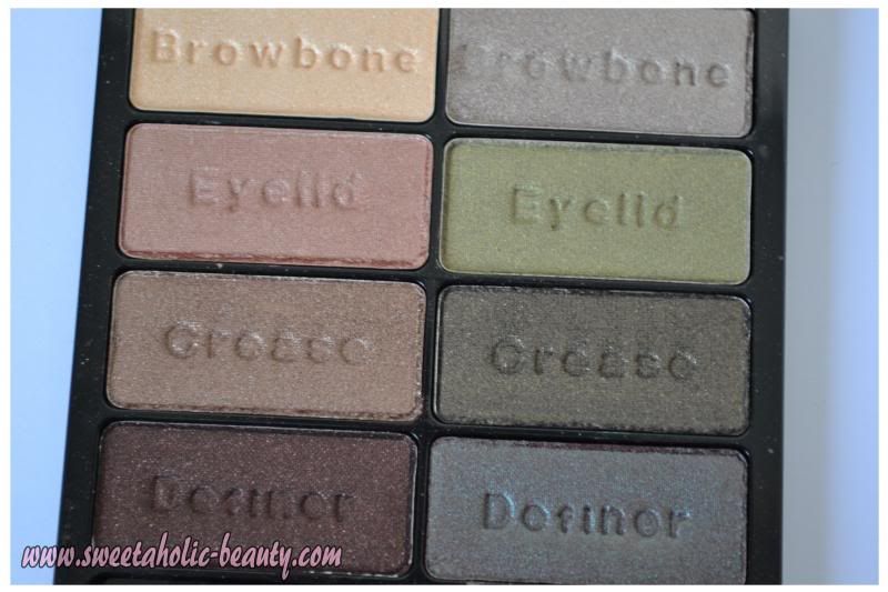
Left Side of the Palette
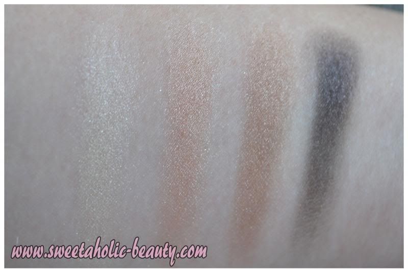
Left to right - Browbone, Eyelid, Crease, Definer
The sheerest of the four is definitely the browbone, although the photo does not do it justice! It comes up a lot brighter on the eye, and is a really gorgeous shade. I'm most impressed the crease colour, but there's a special place in my heart for the definer!
Right Side of the Palette
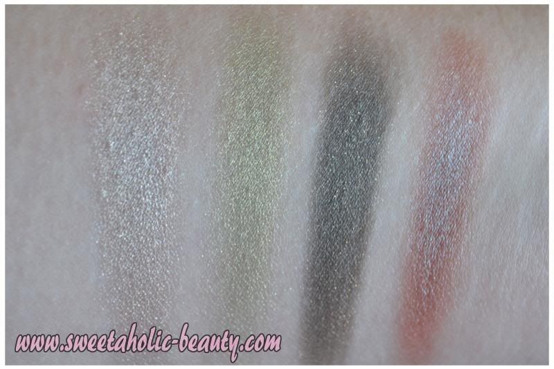
Left to right - Browbone, Eyelid, Crease, Definer
The crease colour on the right side of the palette is a lot more intense, and has since become my favourite colour to use out of the entire palette. Sadly, the definer colour on this side does not come up amazing in photography, as it's a duochrome and changes with the light. It's definitely spectacular in real life, but no amount of photos will do it justice!
--
In terms of pigmentation, all of the above swatches were taken in natural light and with no primer. The shadows are extremely easy to blend as well, and so easy to apply.
Like I said earlier, this has become one of my favourite palettes, and hopefully now you can see why! I've always shied away from greens, because my eyes are brown and I figured that it would be a bit of a clash, but I think these greens are very neutral and don't pop too much to the point they become unwearable - I think these shades could be pulled off by just about anybody. I find it sad that Wet n' Wild isn't readily available on Australian shelves, but can easily be picked up from a variety of online stores - I would absolutely recommend giving them a go if you get the chance!
Have you tried this Wet n' Wild palette before? If so, what did you think?